Introduction
I wrote a small Angular application to learn CSS grid a few years ago. The application has a reactive form with three form groups to input data to generate CSS grid codes. Defining similar form groups is tedious; therefore, I decide to generate dynamic reactive form based on the form group configurations.
In this post, we are going to show the configuration of form groups and the helper functions that iterate the configurations to create the reactive form.
Final result of the dynamic reactive form
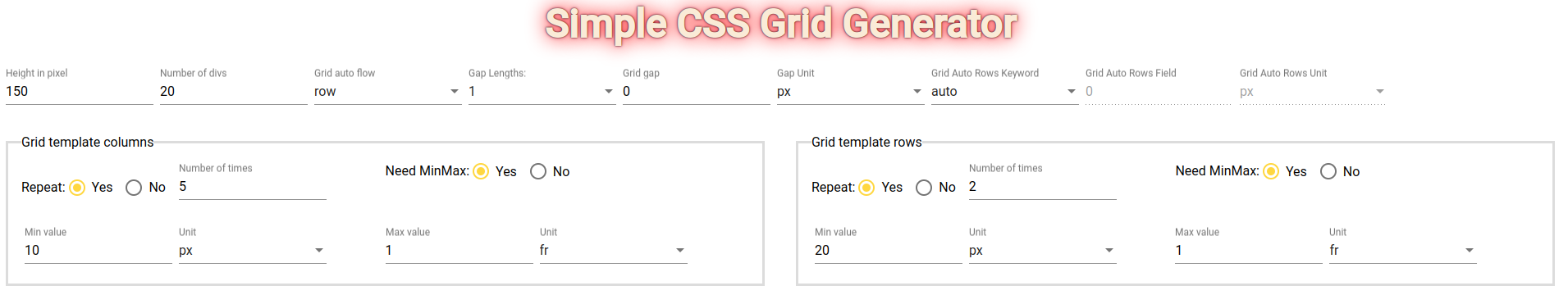
The page has 3 form groups: Grid form, Grid template columns and Grid template rows. Start from scratch to this state takes the following steps
- Create the interfaces and types of form group configuration
- Define the value, properties and validations of each form group
- Combine form group configurations into form configuration
- Pass the form configuration to functions to generate reactive form using FormBuilder service and FormControl.
- Bind reactive form to HTML template
Without further delays, we show the codes added in each step until we initialize the reactive form in ngOnInit().

Create configuration types and interfaces to generate dynamic reactive form
interface CustomFormControlOptions extends AbstractControlOptions {
    initialValue: string | number
}

export type FormGroupConfiguration = Record<string, CustomFormControlOptions>
CustomFormControlOptions has all the properties of AbstractControlOptions and an initial value. In this application, the initial value is either a number or string.
FormGroupConfiguration is a Object map that stores the name and definition of form controls.
These are the type and interface needed to generate the dynamic reactive form.
Define the value, properties and validations of each form group
Since the dynamic reactive form has 3 form groups, we are going to define 3 form group configurations.
First, we set up the initial values of Grid form group and reuse these values in the form group configuration
export const GRID_FORM_START_WITH: GridForm = {
    heightInPixel: 150,
    numDivs: 20,
    gridAutoFlow: 'row',
    numGapLengths: 1,
    gap: 0,
    gapUnit: 'px',
    gapCol: 0,
    gapColUnit: 'px',
    gridAutoRowsKeyword: 'auto',
    gridAutoRowsField: 0,
    gridAutoRowsUnit: 'px',
}
Second, we reuse the starting values in the form group configuration
const GRID_CONTROL_NAMES: FormGroupConfiguration = {
    heightInPixel: {
        initialValue: GRID_FORM_START_WITH.heightInPixel,
        updateOn: 'blur',
    },
    numDivs: {
        initialValue: GRID_FORM_START_WITH.numDivs,
        updateOn: 'blur',
    },
    gridAutoFlow: {
        initialValue: GRID_FORM_START_WITH.gridAutoFlow,
    },
    numGapLengths: {
        initialValue: GRID_FORM_START_WITH.numGapLengths,
    },
    gap: {
        initialValue: GRID_FORM_START_WITH.gap,
        updateOn: 'blur',
        validators: Validators.min(0),
    },
    gapUnit: {
        initialValue: GRID_FORM_START_WITH.gapUnit,
    },
    gapCol: {
        initialValue: GRID_FORM_START_WITH.gapCol,
        updateOn: 'blur',
        validators: Validators.min(0),
    },
    gapColUnit: {
        initialValue: GRID_FORM_START_WITH.gapColUnit,
    },
    gridAutoRowsKeyword: {
        initialValue: GRID_FORM_START_WITH.gridAutoRowsKeyword,
    },
    gridAutoRowsField: {
        initialValue: GRID_FORM_START_WITH.gridAutoRowsField,
        updateOn: 'blur',
    },
    gridAutoRowsUnit: {
        initialValue: GRID_FORM_START_WITH.gridAutoRowsUnit,
    },
}
updateOn property is the updateOn option of FormControl. Similarly, validators property defines the validation functions of FormControl.
Then, we repeat the same process to define the form group of Grid Template Column.
Grid Template Column and Grid Template Row form groups have some commont form control names and values; therefore, we share the names and values in DEFAULT_PROPERTIES map
const DEFAULT_PROPERTIES: FormGroupConfiguration = {
    repeat: {
        initialValue: 'true',
    },
    numOfTimes: {
        initialValue: 2,
        updateOn: 'blur',
    },
    minmax: {
        initialValue: 'true',
    },
    minUnit: {
        initialValue: 'px',
    },
    maxWidth: {
        initialValue: 1,
        updateOn: 'blur',
    },
    maxUnit: {
        initialValue: 'fr',
    },
}
export const TEMPLATE_COLUMNS_START_WITH: GridTemplateInfo = {
repeat: `${DEFAULT_PROPERTIES.repeat.initialValue}`,
numOfTimes: 5,
minmax: `${DEFAULT_PROPERTIES.minmax.initialValue}`,
minWidth: 10,
minUnit: <GridUnitsType>`${DEFAULT_PROPERTIES.minUnit.initialValue}`,
maxWidth: +DEFAULT_PROPERTIES.maxWidth.initialValue,
maxUnit: <GridUnitsType>`${DEFAULT_PROPERTIES.maxUnit.initialValue}`,
}The following is the initial values of Grid Template Column form group
const GRID_TEMPLATE_COLUMN_CONTROL_NAMES: FormGroupConfiguration = {
    ...DEFAULT_PROPERTIES,
    numOfTimes: {
        initialValue: TEMPLATE_COLUMNS_START_WITH.numOfTimes,
        updateOn: 'blur',
    },
    minWidth: {
        initialValue: TEMPLATE_COLUMNS_START_WITH.minWidth,
        updateOn: 'blur',
    },
}
Finally, we define the Grid Template Row form group configuration
export const TEMPLATE_ROWS_START_WITH: GridTemplateInfo = {
    repeat: `${DEFAULT_PROPERTIES.repeat.initialValue}`,
    numOfTimes: +DEFAULT_PROPERTIES.numOfTimes.initialValue,
    minmax: `${DEFAULT_PROPERTIES.minmax.initialValue}`,
    minWidth: 20,
    minUnit: <GridUnitsType>`${DEFAULT_PROPERTIES.minUnit.initialValue}`,
    maxWidth: +DEFAULT_PROPERTIES.maxWidth.initialValue,
    maxUnit: <GridUnitsType>`${DEFAULT_PROPERTIES.maxUnit.initialValue}`,
}
const GRID_TEMPLATE_ROW_COLUMN_NAMES: FormGroupConfiguration = {
...DEFAULT_PROPERTIES,
minWidth: {
initialValue: TEMPLATE_ROWS_START_WITH.minWidth,
updateOn: 'blur',
},
}We have completed the tough part and the next three parts only get easier

Combine form group configurations into form configuration
export const FORM_CONFIGURATION: Record<string, FormGroupConfiguration> = {
    grid: GRID_CONTROL_NAMES,
    gridTemplateColumns: GRID_TEMPLATE_COLUMN_CONTROL_NAMES,
    gridTemplateRows: GRID_TEMPLATE_ROW_COLUMN_NAMES,
}
FORM_CONFIGURATION is a form configuration composed of grid form group, grid template column form group and grid template row form group
Generate dynamic reactive form
In order to generate the dynamic reactive form, we have to create two helper functions: createFromGroup and
private createFormGroup(controlNames: FormGroupConfiguration): Record<string, FormControl> {
        return Object.keys(controlNames).reduce((acc, field) => {
            const option = controlNames[field]
            const { initialValue: value, updateOn, validators, asyncValidators } = option
            const control = updateOn
                ? new FormControl(value, { updateOn, validators, asyncValidators })
                : new FormControl(value, validators, asyncValidators)
            acc[field] = control
            return acc
        }, {} as Record<string, FormControl>)
}
private createForm(formConfiguration: Record<string, FormGroupConfiguration>) {
return Object.keys(formConfiguration).reduce((acc: Record<string, FormGroup>, formGroupName) => {
const formGroupConfiguration = formConfiguration[formGroupName]
const formGroup = this.createFormGroup(formGroupConfiguration)
acc[formGroupName] = this.fb.group(formGroup)
return acc
}, {})
}createFormGroup creates FormControl instance for each form control option and returns a form control map. createForm iterates form configuration and executes createFormGroup to return a form group map.
In ngOnit(), we put everything together to create a form group of form groups and assign to form instance member
ngOnInit() {
    this.form = this.fb.group(this.createForm(FORM_CONFIGURATION))
    ....
}
Bind reactive form to HTML template
<form [formGroup]="form" novalidate>
    <section class="dimensions">
        <app-grid-form formGroupName="grid"></app-grid-form>
    </section>
    <section class="section-form">
        <app-grid-template-form
            class="app-grid-template-form"
            formGroupName="gridTemplateColumns"
            [legend]="'Grid template columns'"
        ></app-grid-template-form>
        <app-grid-template-form
            class="app-grid-template-form"
            formGroupName="gridTemplateRows"
            [legend]="'Grid template rows'"
        ></app-grid-template-form>
    </section>
</form>
The rest is to create HTML form in the template and bind form to formGroup input. The form was refactored into components; therefore, we pass form group names (grid, gridTemplateColumns and gridTemplateRows) to the custom components to render the form controls
Bonus
Currently, we write all the configurations on the client-side, however, we can move these configurations to the server-side for enterprise scale ful-stack application. If the application uses a NoSQL database (Mongo, DynamoDB), we can persist the values as-is. If the application uses a relational database, the table can add jsonb columns to persist the configurations.
Final thoughts
In this post, we have seen one way of creating dynamic reactive form based on configuration. If we decide to add another form group, we simply define a new FormGroupConfiguration object, add it to FORM_CONFIGURATION and update the HTML template.
This is the end of the blog post and I hope you like the content and continue to follow my learning experience in Angular and other technologies.

Resources:
- Github Repository: https://github.com/railsstudent/ng-simple-cssgrid-generator
- FormControl: https://angular.io/api/forms/FormControl